
Web design
Building resilience and innovation in an interactive language
Built the foundational brand identity for this startup non-profit think tank, encompassing digital, print, and internal brand guidelines, as their first in-house designer.
Role: Web designer & builderClient: Center for Asia-Pacific Resilience and InnovationYear: 2022
Visit Live Site
Calibrating the modern design trend to the conventional think tank industry
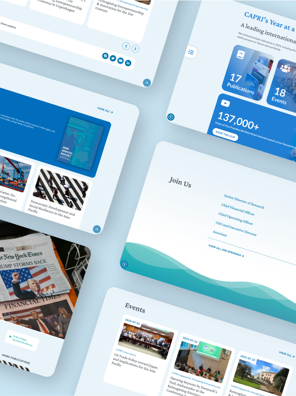
Upon its establishment, CAPRI aims to stand out from other existing think tanks by adapting progressive value and conducting cross-disciplinary research. Transforming these identities into visual languages, I used a more modern approach on the website’s visual. I want the target audience grasp the idea of CAPRI’s values by just visiting the website.
CAPRI’s brand stands out with its nuanced positioning of transnationalism, inclusivity, and exchange between sectors. My job was to present the information needed and keep this brand voice consistent across the site.

CAPRI's website is the first website that I built with WordPress from scratch all by myself, including the technical setup. I still remember how I dug into the Internet and search for a solution to a bug or the way to achieve my client’s request when AI tools was not common at all.
The navigating system
Just like all the other the website is the home to numerous
Translating values into visuals
With the conscious usage of the the blue color in the CAPRI logo as the major color of the website, I aim to create an default looking CAPRI, and therefore leave an impression in visitors’ memory.
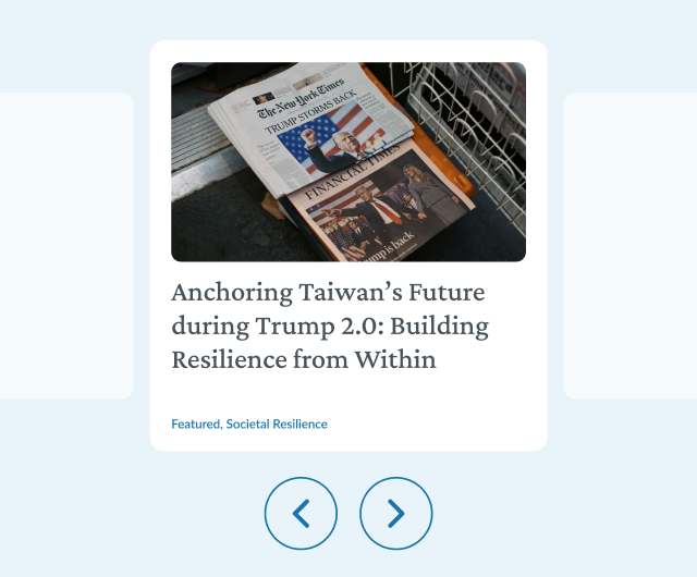
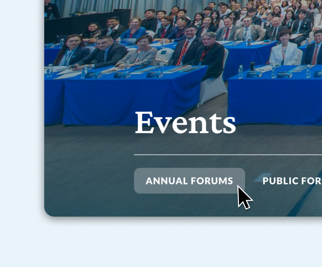
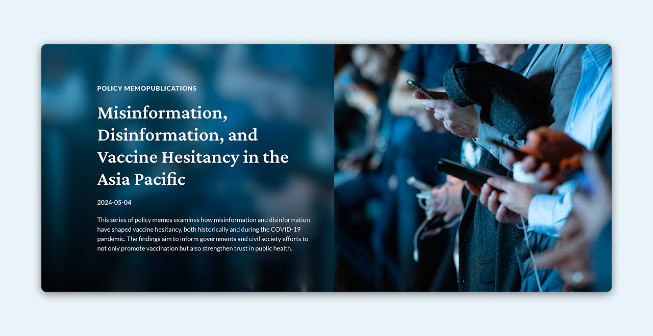
I used CAPRI's signature blue as the primary color throughout the website, with a subtle 10% opacity version serving as the background to create visual cohesion. Photography plays a crucial role on the site, conveying CAPRI's integrity and authenticity. To maintain readability while preserving visual continuity, I implemented a glass-like effect by softly blurring photos and applying a gradient blue overlay.

Since the website features lengthy research articles, I prioritized creating a comfortable reading experience by carefully adjusting the color contrast. For the body text, I chose a dark bluish-gray against the light blue background to achieve clear readability without causing eye strain.
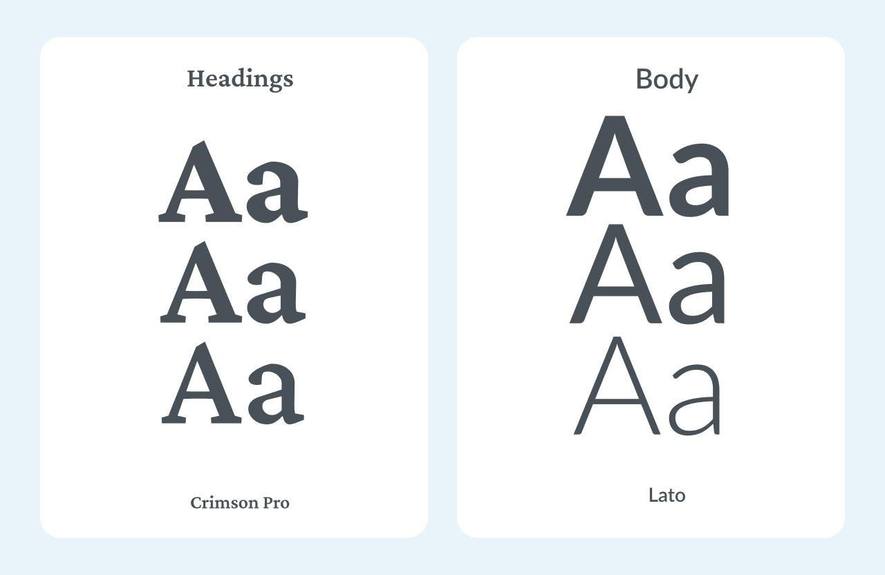
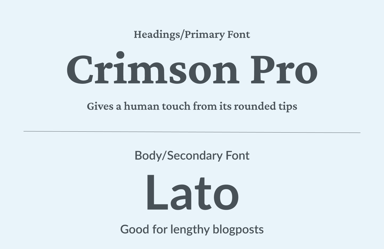
For typography, Crimson Pro is used in headings to give a human touch from its rounded tips, and Lato for the body text to create a slick and clean look, making reading easier.
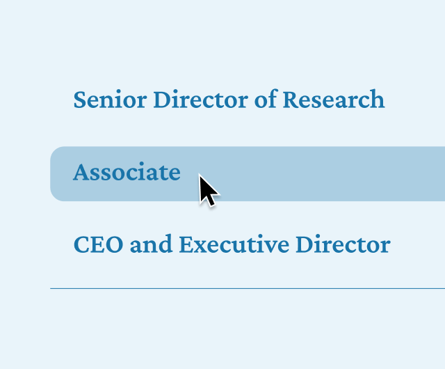
Referencing Google’s Material 3 design system, I used the difference of colors to create box that can group information easily.
“CAPRI's website is the blue one, right?” A journalist once asked me when I told him I’m the designer of this website. At that moment, it hit me that how much consistent visuals matter to a brand.
About
Sylvia Chen


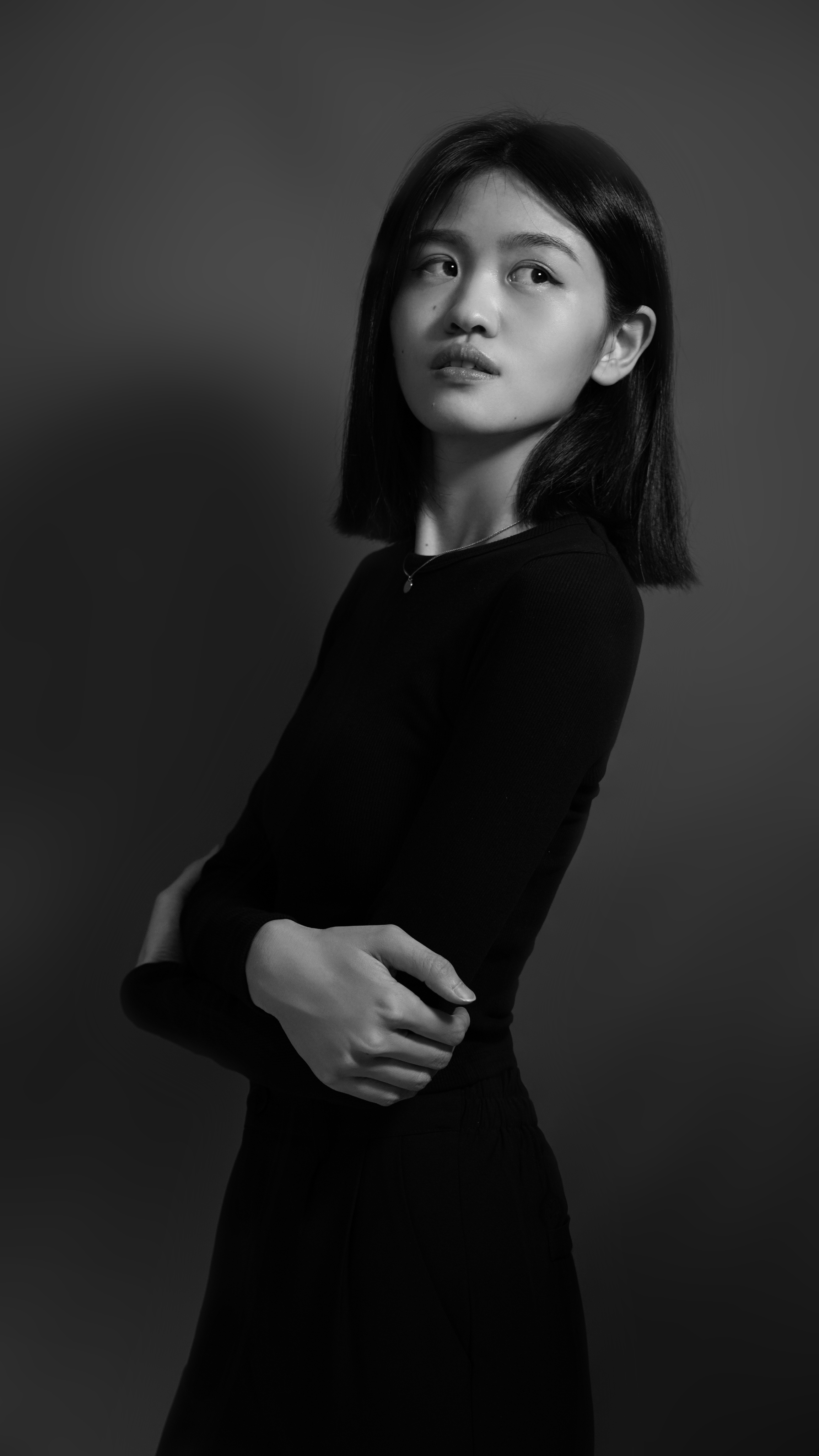

2022-present

Communication Designer
Center for Asia-Pacific Resilience and Innovation (CAPRI)
- The first in-house designer of the think tank
- Built the think tank’s official website
- Manage the think tank’s brand visual identity
2019-2022

Public Affairs Assistant
Foundation for Scholarly Exchange (Fulbright Taiwan)
- Participated in the brand’s global rebranding efforts by updating the logo, the souvenirs, and the website
- Managed the foundation’s official website as the singular in-house designer

Contact
sylviafnchen@gmail.com
Schedule an Online Call
© 2025 Sylvia Chen. All Rights Reserved.
Web design
Building resilience and innovation in an interactive language
Built the foundational brand identity for this startup non-profit think tank, encompassing digital, print, and internal brand guidelines, as their first in-house designer.
Role: Web designer & builderClient: Center for Asia-Pacific Resilience and InnovationYear: 2022
Visit Live Site

CAPRI's website is the first website that I built with WordPress from scratch all by myself, including the technical setup. I still remember how I dug into the Internet and search for a solution to a bug or the way to achieve my client’s request when AI tools was not common at all.
Calibrating the modern design trend to the conventional think tank industry
Upon its establishment, CAPRI aims to stand out from other existing think tanks by adapting progressive value and conducting cross-disciplinary research. Transforming these identities into visual languages, I used a more modern approach on the website’s visual. I want the target audience grasp the idea of CAPRI’s values by just visiting the website.
Calibrating the modern design trend to the conventional think tank industry
With the conscious usage of the the blue color in the CAPRI logo as the major color of the website, I aim to create an default looking CAPRI, and therefore leave an impression in visitors’ memory.
Translating values into visuals
With the conscious usage of the the blue color in the CAPRI logo as the major color of the website, I aim to create an default looking CAPRI, and therefore leave an impression in visitors’ memory.
I used CAPRI's signature blue as the primary color throughout the website, with a subtle 10% opacity version serving as the background to create visual cohesion. Photography plays a crucial role on the site, conveying CAPRI's integrity and authenticity. To maintain readability while preserving visual continuity, I implemented a glass-like effect by softly blurring photos and applying a gradient blue overlay.
Since the website features lengthy research articles, I prioritized creating a comfortable reading experience by carefully adjusting the color contrast. For the body text, I chose a dark bluish-gray against the light blue background to achieve clear readability without causing eye strain.
For typography, Crimson Pro is used in headings to give a human touch from its rounded tips, and Lato for the body text to create a slick and clean look, making reading easier.
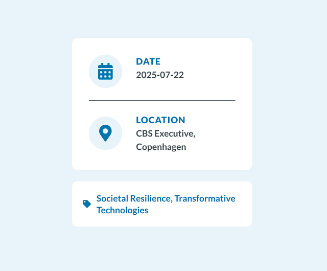
Referencing Google’s Material 3 design system, I used the difference of colors to create box that can group information easily.
“CAPRI's website is the blue one, right?” A journalist once asked me when I told him I’m the designer of this website. At that moment, it hit me that how much consistent visuals matter to a brand.
About
Sylvia Chen

2022-present
Communication Designer
Center for Asia-Pacific Resilience and Innovation (CAPRI)
- The first in-house designer of the think tank
- Built the think tank’s official website
- Manage the think tank’s brand visual identity
2019-2022
Public Affairs Assistant
Foundation for Scholarly Exchange (Fulbright Taiwan)
- Participated in the brand’s global rebranding efforts by updating the logo, the souvenirs, and the website
- Managed the foundation’s official website as the singular in-house designer

Contact
sylviafnchen@gmail.com
Schedule an Online Call
© 2025 Sylvia Chen. All Rights Reserved.